We use Kdenlive and GIMP to create a title: we transform a frame into a drawing, color it, and insert the text. We will also add transitions to animate the title entering the scene.
A film must be recognized immediately, to enter the imagination of its audience: if a film remains anonymous, the people who watch it will forget it after a few minutes. And for online videos, like the ones we publish on YouTube, it is even more true: on the internet the “competition” is so wide that if you do not recognize yourself, you risk being never able to get noticed compared to all the other authors of video clips. Each video can leave its mark in many ways: an epic scene, a good combination of images and soundtrack, unpredictable editing choices. And a title. Each movie has a title, and sooner or later you have to make it appear in the video. And the way the title appears makes a lot of sense about the style we want to impress on the movie. There are different types of titles that can be made, even in the films we see in the cinema we go from extremely elaborate titles and titles that seem written with the marker on a sheet of paper placed in front of the camera. For many videos, the solution is simple: you write a text, even with the Kdenlive Titles editor. Two lines of text, two or three colors, a monochromatic background. Of course, if you want to make a “headline” title like that of Austin Powers it is, in the end, a real film within the film. A good middle ground, which requires little time for the realization but still offers a good result, is that of the good, the bad, the ugly, Sergio Leone’s masterpiece: to combine the texts of the drawings. The title is not simply imprinted on the frame, but an attempt is made to transform the movie into a drawing. And, of course, you can also animate the lyrics. This is precisely the idea we want to present: a simple but captivating title, and we will realize it obviously starting from a clip shot with the video camera. This clip will have to be stopped at some point for the title to appear, and then we can start it again from the same point. The moment the action stops we take the frame and begin to modify it with GIMP, the most powerful photo editing program in the free and open source world. This program will be used to transform the frame into a two shades of brightness design. In a nutshell, we will get a black drawing on a white background. And we will do it automatically, using the Threshold tool, which takes care of translating a photograph into an image with only two colors depending on the threshold we set. Obviously, since the images we shoot with the video camera do not have a very high contrast (otherwise the colors are unwatchable), we will need to repeat the threshold operation several times, but we can then easily combine all the various designs by overlapping them as we prefer. Once the desired result has been obtained, it will be possible to color this two-colored design with a color gradient, to make it obviously more pleasant. At this point we can add the text, better if dividing it on several levels. By exporting the various levels separately, in fact, we can then control their position with Kdenlive, making the background appear with a fading and making the various portions of text enter the scene with an animation, to prevent the text from appearing too still. As always, you can see the example video at the following address: https://www.youtube.com/watch?v=EZg4BXD32uM
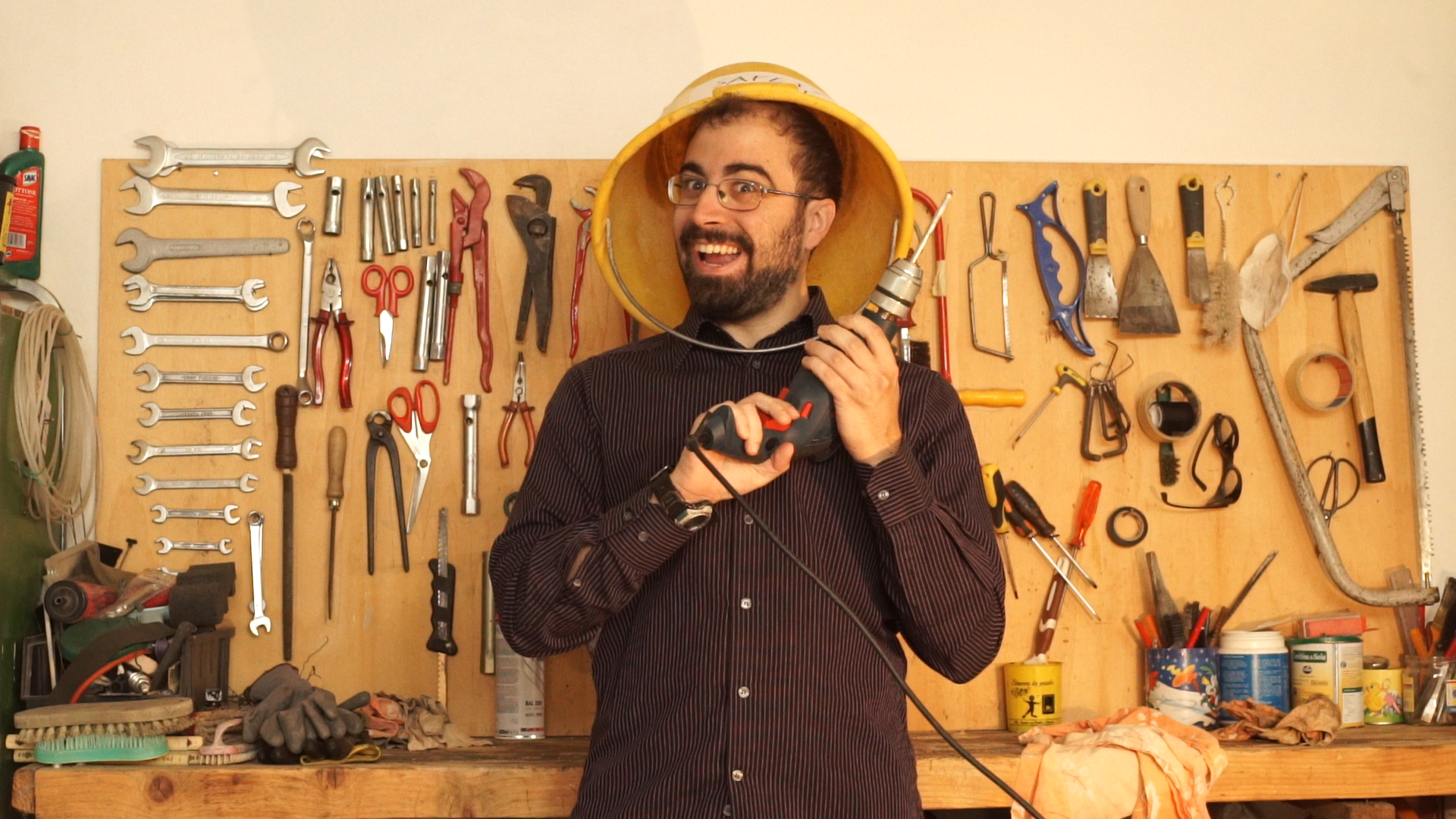 The frame from which we start
 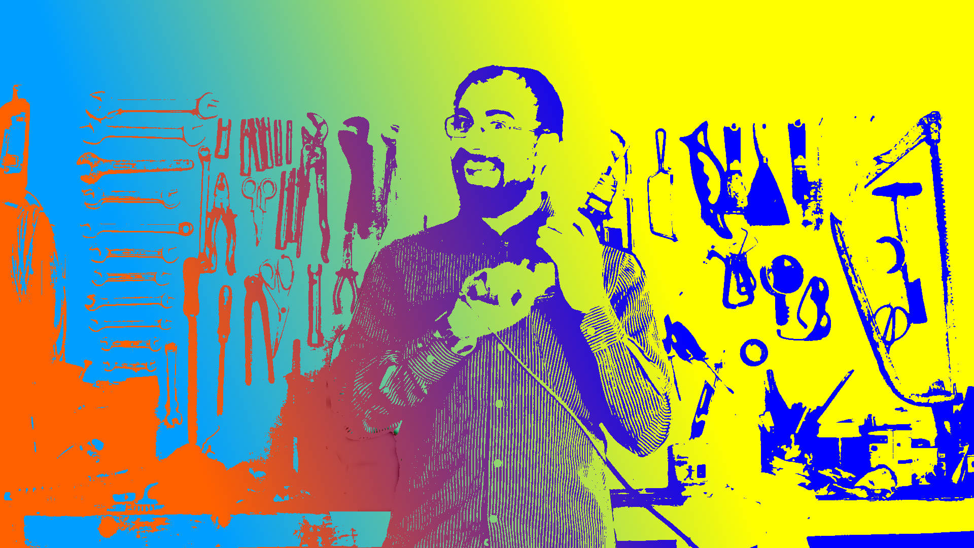 The background image of the title produced by the frame
 The characters for the text
Obviously, when preparing a title, one of the key factors to consider is the font, that is, the character you want to use for the title. In general, it is better to focus on a legible font, something not too complicated. For example, the classics Arial, Courier New, Times New Roman, and Verdana. In the field of free and open source software one of the most pleasant fonts is Ubuntu, and there is also Oxygen. But you can also focus on more elaborate characters, just find something suitable for the theme of our movie. A good library containing many free fonts is https://fontlibrary.org/ . S On the site you can see a preview of the various characters: there are some that simulate handwriting in italics, others that recall the screens of the signboards, and practically for all tastes.
When does the title appear?
We choose the frame in which the title will appear
 1 WITH SCISSORS – Let’s start by entering in the track Video1 the original video clip, on which the movie title should appear. The clip should be cut with the tool Scissors , when the title has to appear.
  2 THE PHOTOGRAM – We move the second part of the clip, just cut, to create a space and position ourselves on the last frame of the first part of the clip. Then, click on the menu located under the Project monitor and we choose Extract frame .
 Produce a silhouette
We transform the image into black and white, like a drawing
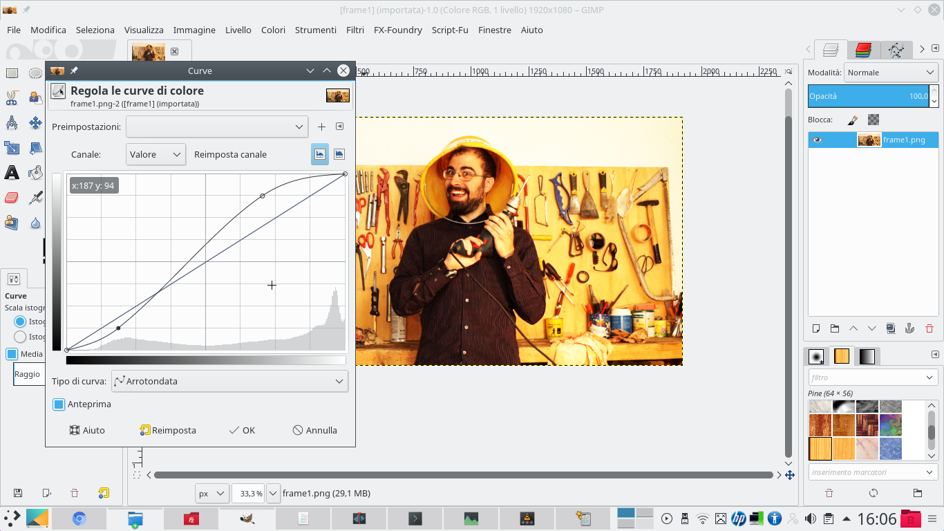 1 THE CONTRAST – We open the frame extracted with GIMP: first we need to improve its contrast. We can do this using the menu Colors / Curves . Just raise the highlights and lower the shadows to increase the contrast a little.
  2 DUPLICATION– This will be the starting image: we click on the level with the right button and choose the item Duplicate level . Then, we make the original layer invisible by clicking on the eye-shaped button next to its name.
  3 LA SILHOUETTE – Working on the copy, we choose the menu Colors / Threshold . Here we have to move the black selector until we get a good shilhouette of the scene. The operation is simple: everything we enter in the selection will be white, the rest black.
  4 ANOTHER THRESHOLD – It is likely that with a single “threshold” we will not be able to have a good silhouette. Just duplicate the original layer again and apply the effect again Colors / Threshold , and choose a threshold that makes an area visible that was not previously.
 From the background to the title
We complete the background with a gradient and add the text
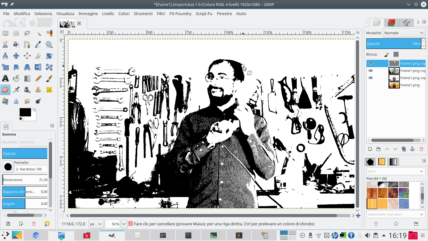 1 WE DELETE – Finishing images is simple: just use the rubber , choosing a brush that has clear edges. The areas that are too white or too black must be deleted, in order to bring up what is underneath (the other levels of “thresholds” that we have created).
  2 A MERGER – If we have multiple levels of “thresholds”, we must join them by clicking on the upper level and choosing Bottoms at the bottom . The black and white layer that remains must have a type mode Difference . We will see that the colors are reversed.
  3 A GRADIENT – We add a new level by clicking on the button New level . The level should be placed below the black and white level. Then, let’s take the tool Gradient and we choose a foreground and background color that we like (for example orange and blue).
 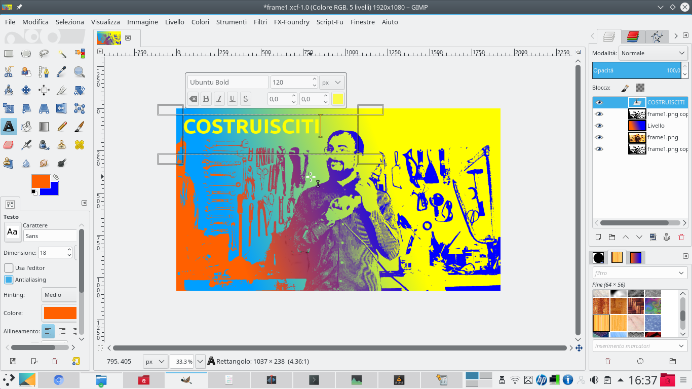 4 THIS IS THE TITLE – By drawing a line on the level you can color it with the gradient, and you will see the image appear in opposite colors. We add the title in pieces, a couple of words at a time, with the tool Text , choosing colors that look good.
 Let’s give some movement
We use Kdenlive to animate the appearance of the various elements of the title
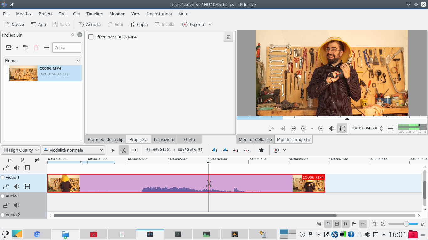
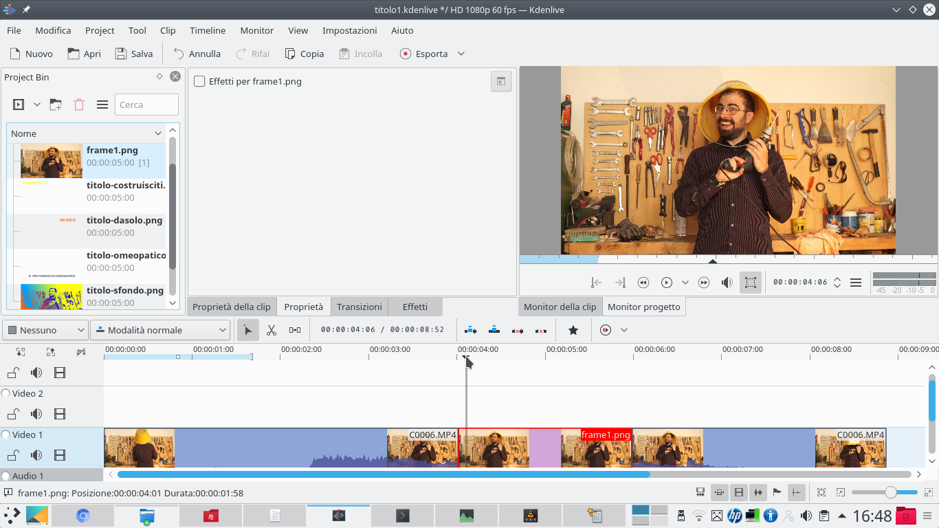 1 EXPORT TO PNG – We export the image to PNG three times: first only the background, then each of the texts at a time. Returning to Kdenlive, we insert the extracted frame between the two clips, in the track Video1 . Let’s add the other clips to the project.
  2 THE COMPOSITION – Then we add in the track Video2 , exactly above the frame, the background produced with GIMP. We insert a transition of type Composite . We add keyframes shortly after the start and just before the end of the clip.
  3 OPACITY FROM 0 TO 100 – The first and last frames must have opacity 0 , the other two “interiors” 100 . We put the first text in the track Movie3 , with a transition Composite . Shortly after the start of the clip, we add a keyframe.
  4 OTHER TRACKS – Let’s go back to the first frame and move the title outwards, so that it is not visible. For the next texts, we add a new track by clicking on the last one with the right button and choosing Add new track .
  5 REFERENCE TO VIDEO2 – We repeat the same mechanism for all the text clips we have: however, remember that for each clip the transition Composite must refer to the track Video2 . That is in fact the trace of the background that performs its fading.
  6 REPEAT AGAIN – The idea, for each text, is to dedicate a track to it, insert a transition referred to Video2 , create a key frame at a certain point (it will be the point where the text appears) and return to the first key frame to position the title out of frame.